Brand Guidelines: The Founder's Guide to a System That Holds Up
At that point, the problem is not taste. It is consistency. And inconsistency, for a growing business, is expensive.
A serious brand guidelines document, what French markets call a charte graphique, is not a decorative file. It is the operating system that keeps your company recognizable across every place a customer meets it. Done well, it protects perception, accelerates execution, and lowers the cost of every future design decision.
This guide breaks down what real brand guidelines contain, why founders should treat them as a business asset, the mistakes that destroy them in twelve months, and a five-step framework you can use to build your own.
What brand guidelines actually are
Brand guidelines are the rules that govern how a brand looks, sounds, and behaves visually. They cover the logo, color, typography, imagery, layout, and tone — and, more importantly, how all of those work together in real-world use.
The common mistake is to think of guidelines as documentation. They are not. Documentation describes what exists. Guidelines decide what is allowed. The difference is operational. A documented logo is a file. An allowed logo has size rules, clear-space rules, color rules, background rules, and a list of misuses that protect it from being weakened by the next person who opens it.
A clean way to think about it: if a new designer, a new freelancer, or a new printer joined your business tomorrow, your guidelines should let them produce on-brand work by the end of the week without anyone holding their hand.
Why brand guidelines matter for revenue, not just design
Founders sometimes treat guidelines as a back-office task. The opposite is true. Brand guidelines directly influence three things that affect revenue.
1. Perception
Customers judge a business in fractions of a second. If your sales deck, website, and social content look like three different companies, the prospect quietly downgrades their confidence in you. They will not say it out loud. They will simply hesitate longer, negotiate harder, or churn faster.
2. Speed
Every time someone in your team has to ask which font, which red, which logo version, you lose an hour. Multiply that across a year, across freelancers, across launches, and the cost becomes obvious. Guidelines remove the back-and-forth.
3. Cost of future design
When you redesign a deck, build a new landing page, ship a packaging update, or hire a new agency, the project is twice as fast and half as expensive if the brand system already exists. Without guidelines, every new project pays a tax: redefining the brand from scratch.
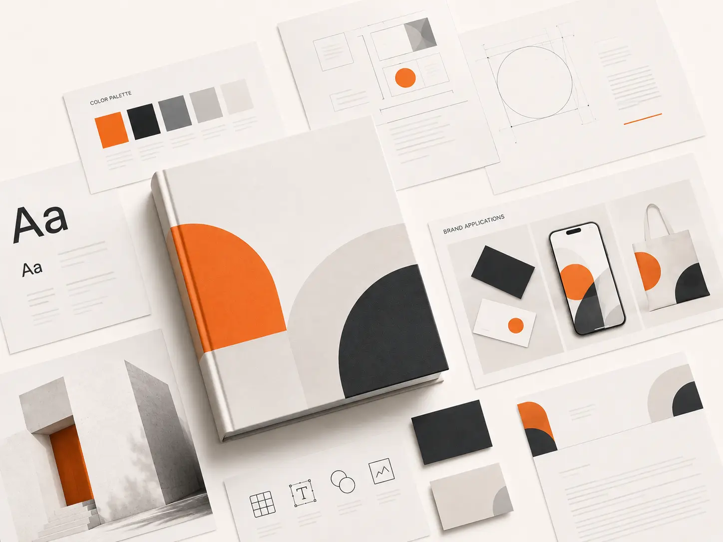
The core components of a real brand system
If you only see a logo sheet and three color swatches, you are not looking at a brand system. You are looking at a starter kit. A real charte graphique covers the following.
Logo system
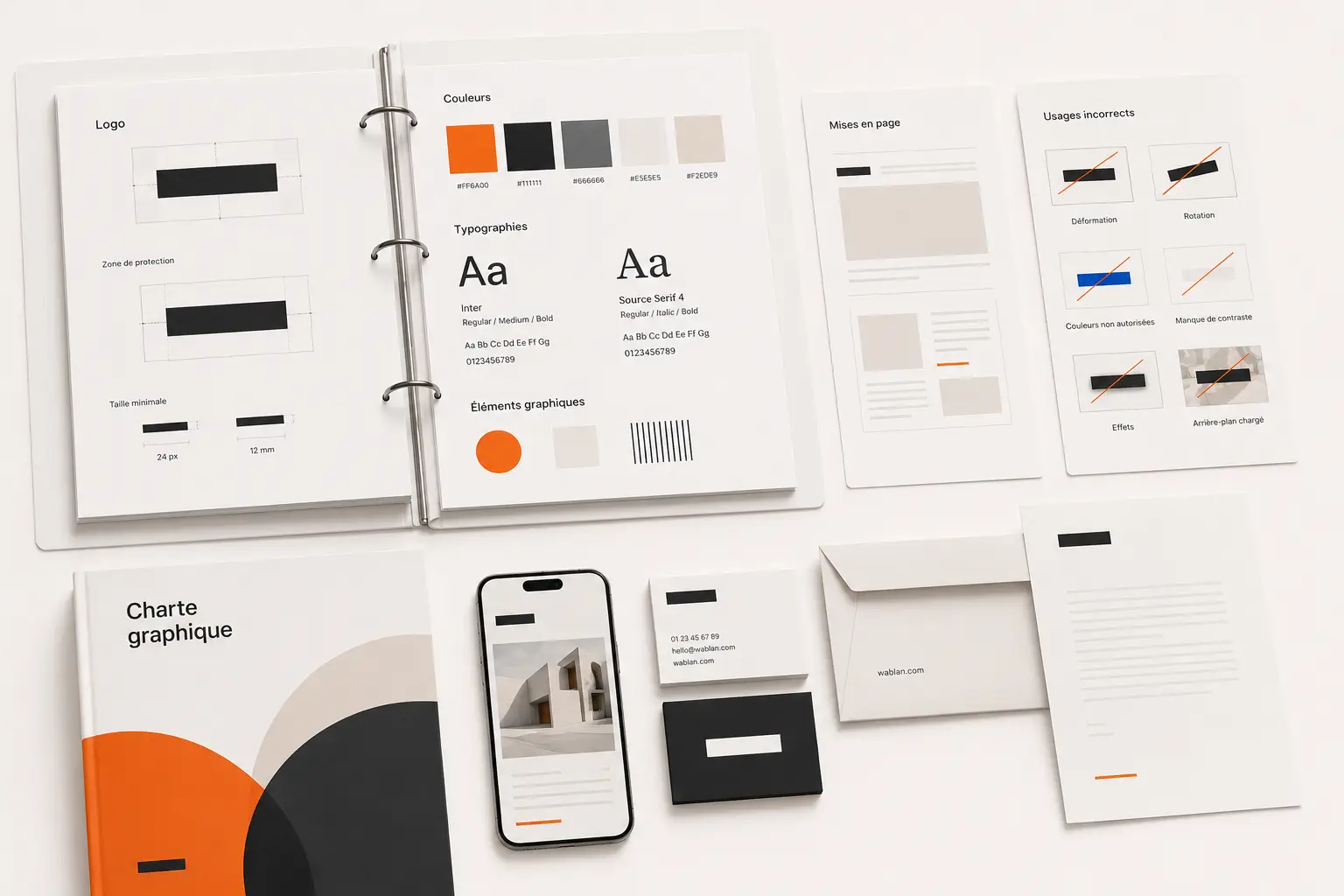
Not one logo, a system. Primary mark, secondary lockup, simplified version for small sizes, monochrome version, app-icon version where relevant. Then the rules: minimum size, clear space, allowed backgrounds, and a list of misuses. The misuses page is often skipped, and that is exactly the page that prevents your brand from being mangled later.
Color system
Primary colors, secondary colors, neutrals, and accent colors — each with exact values for digital and print. A good color system also defines hierarchy: which color leads, which color supports, which color is reserved for calls to action. Without that hierarchy, every new asset becomes a guess.
Typography system
Headline font, body font, and a support font if the brand needs one. Each font gets roles, weights, sizes, spacing rules, and digital fallbacks. If you operate across English, French, or Arabic, the system also has to handle multilingual pairing without breaking visually.
Imagery and art direction
The kind of photography you use, the way subjects are framed, the lighting mood, the use of illustration or icons, the treatment of empty space. This is where premium brands separate themselves from generic ones. The logo rarely makes a brand look expensive. The imagery system does.
Layout and grid principles
How content is arranged. Spacing rhythm, alignment, grid behavior, hierarchy across pages and screens. Without layout rules, even strong logos and fonts produce messy output.
Application examples
The part most agencies underdeliver. How the brand actually appears on a homepage, a pitch deck, an Instagram carousel, a print brochure, a packaging box, a sign outside the office. A brand system that has not been tested against real applications is not finished.
Concrete examples: what changes when the system is in place
A SaaS startup preparing a fundraising round. Before guidelines: three pitch decks circulating, each slightly different, founders editing slides at midnight. After guidelines: one deck template, on-brand by default, used across investor calls and partner pitches. The conversation moves from "how do we look?" to "what are we offering?"
A boutique clinic in Casablanca. Before guidelines: the receptionist sends documents in one font, the marketing freelancer uses another on Instagram, the printed brochure has a third. The clinic looks fragmented even though the service is excellent. After guidelines: every touchpoint feels like the same business, and the perception of professionalism rises before the first appointment.
An ecommerce brand running paid ads. Before guidelines: every ad creative is a one-off, the team rebuilds the look constantly, and conversion rates fluctuate for no clear reason. After guidelines: ad creative ships in half the time, ad sets become testable, and brand recall starts compounding instead of resetting.
Real brand examples worth studying
Look at how Airbnb structures its visual language: a single mark, a defined color, a strict illustration system, and rules tight enough that every market in the world feels like the same company. Look at how Stripe handles typography and product imagery: restraint as a signal of seriousness. Look at how Aesop maintains an editorial, almost typographic discipline across stores, packaging, and digital.
You are not copying them. You are noticing the pattern. The brands that feel premium operate from a system, not from one good-looking artifact. The system is the moat.
A five-step framework to build your brand guidelines
Step 1: Align on positioning
Guidelines without positioning are decoration. Before any visual choice, the team should be clear on who the brand serves, what category it competes in, and how it wants to be perceived against alternatives. The visual system has to express that position, not contradict it.
Step 2: Decide the brand direction
Premium or accessible. Bold or restrained. Editorial or functional. Local or international. Playful or serious. These are not moodboard games. They are commercial decisions that will shape every visual choice that follows.
Step 3: Build the components
Translate the direction into the building blocks: logo, color, typography, imagery, layout. Make each decision in service of the positioning, not in isolation. Every component should reinforce the same perception goal.
Step 4: Pressure-test against real applications
Take the system and apply it to your actual surfaces: homepage, sales deck, Instagram post, ad creative, signage, packaging, invoice. If any surface forces an exception or a workaround, the system is not finished. Fix it before delivery.
Step 5: Ship a document your team can actually use
The final deliverable is not the pretty PDF. It is the combination of clear rules, working files, and templates your team can open and use the next morning. If the document needs the agency in the room to be applied, the project failed.
The mistakes that destroy brand guidelines within a year
Confusing a logo file with a brand system
The most common one. A founder receives a logo, three color values, and assumes the brand is done. Six months later, the team has invented its own fonts, colors, and layout patterns. The brand drifts. The cleanup costs more than the original investment would have.
Building guidelines without thinking about who will apply them
If the document is written for designers but your team is a founder, an assistant, and two freelancers, the guidelines will not survive contact with reality. The right document is calibrated to the people who will actually use it.
Skipping the misuse pages
The misuse pages are not filler. They are protection. Without them, every new collaborator will eventually stretch, recolor, or reposition the logo in a way that weakens the brand. A short list of "do not do this" pages prevents a year of slow erosion.
Buying a 60-page document nobody opens
Length is not quality. Some of the strongest brand systems live in 20 focused pages. Some of the weakest live in 120. The question is not how much was written, but how much can be applied tomorrow.
Ignoring multilingual reality
If your business operates across French, English, and Arabic, your guidelines have to address it. Otherwise typography breaks, layouts misalign, and the Arabic version always ends up looking like an afterthought.
Treating guidelines as a one-off project
The other quiet killer. The document gets delivered, signed off, filed somewhere, and never opened again. A real brand system is maintained. Someone owns it. New launches feed back into it. Edge cases get added when they appear. If nobody owns the brand internally after delivery, the most beautiful guidelines in the world will still drift inside a year.
The Morocco and francophone reality
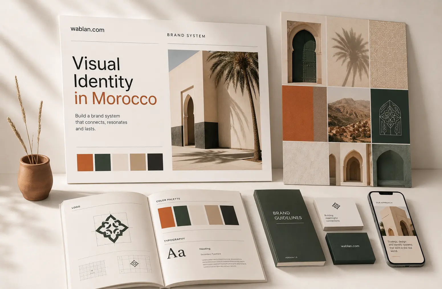
If you operate in Morocco or in French-speaking markets more broadly, brand guidelines are even more important than the average startup advice suggests. The market still contains a large amount of visual sameness. Same agency tropes, same palettes, same generic layouts, same surface-level branding language. That is the bad news. The good news is that any business willing to build a real system stands out almost immediately.
The catch is that local realities add complexity. A Moroccan brand often needs to live across French, English, and Arabic. It needs to look right on Instagram and on a printed menu, on a WhatsApp business profile and on a sign outside the shop. It needs to feel premium in Casablanca and still translate cleanly in Marrakech or Tangier. A serious brand system anticipates that. A weak one collapses the first time a real-world surface is added.
This is also where the gap between freelance work and structured agency work becomes visible. A logo on its own is easy to deliver. A system that holds across languages, channels, and growth stages is not. That is exactly the work brand guidelines exist to do.
How brand guidelines connect to the rest of your branding work
Brand guidelines do not exist in isolation. They sit at the center of a larger system. If you are still defining your logo, our guide to logo creation in Morocco walks through the foundational decisions. If you are evaluating budget, logo pricing in Morocco gives a realistic picture. If you are deciding whether to bring in a partner, what to expect from an agence charte graphique covers the evaluation process. If you are looking at agencies locally, our piece on branding agencies in Casablanca goes deeper on how to choose. And for the broader system view, our article on visual identity in Morocco explains how guidelines fit inside a complete identity.
FAQ
What is the difference between brand guidelines and a visual identity?
Visual identity is the complete system: how your brand looks, feels, and is expressed. Brand guidelines, the charte graphique, are the rulebook that explains how to apply that identity consistently. Identity is the design. Guidelines are the governance.
How long should brand guidelines be?
Long enough to cover the real applications of the brand. Short enough that your team will actually use it. For most early-stage businesses, 20 to 40 focused pages is more useful than a 100-page document nobody opens. Quality of rules beats quantity of pages.
Do small businesses really need brand guidelines?
Yes, often more than they expect. Small teams work with multiple freelancers, switch tools often, and have little time to fix inconsistency later. Clear guidelines from the start prevent expensive rework and make the business look more credible while it is still small.
How often should brand guidelines be updated?
Lightly every year, seriously every two to three years, and fully whenever the business shifts strategy, audience, or category. The system should evolve with the business, not freeze the day it was delivered.
Can a brand exist without guidelines?
Yes, but not consistently. Without guidelines, the brand becomes whatever the next person to design something decides. That works until you grow, hire, or sell across multiple channels. After that, the lack of system shows up in every customer touchpoint.
Need a brand system that actually holds up?
If your business has outgrown the one-logo-and-three-colors stage and you can feel the brand drifting across every new asset, this is the right moment to build a real system. Blan Studio helps founders and modern businesses turn scattered branding into guidelines that are clear, premium, and usable from day one. If you want a sharper view of what your brand is missing, we can review it with you. Reach us via contact or see pricing.
محتاج مساعدة؟
تواصل معانا →